Reinventing the apparel brand for today's cosmopolitan man.
Services
BRAND SEGMENTATION
BRAND IDENTITY
VISUAL SYSTEM
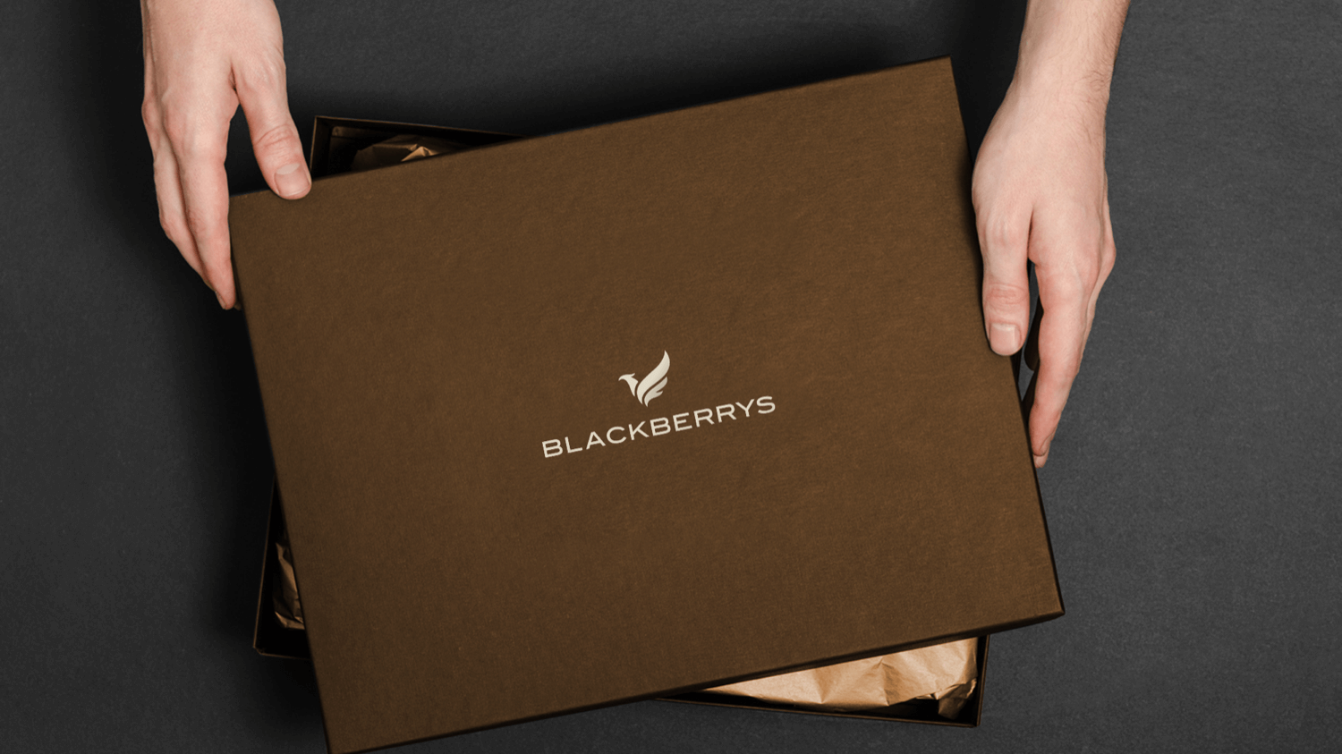
PACKAGING
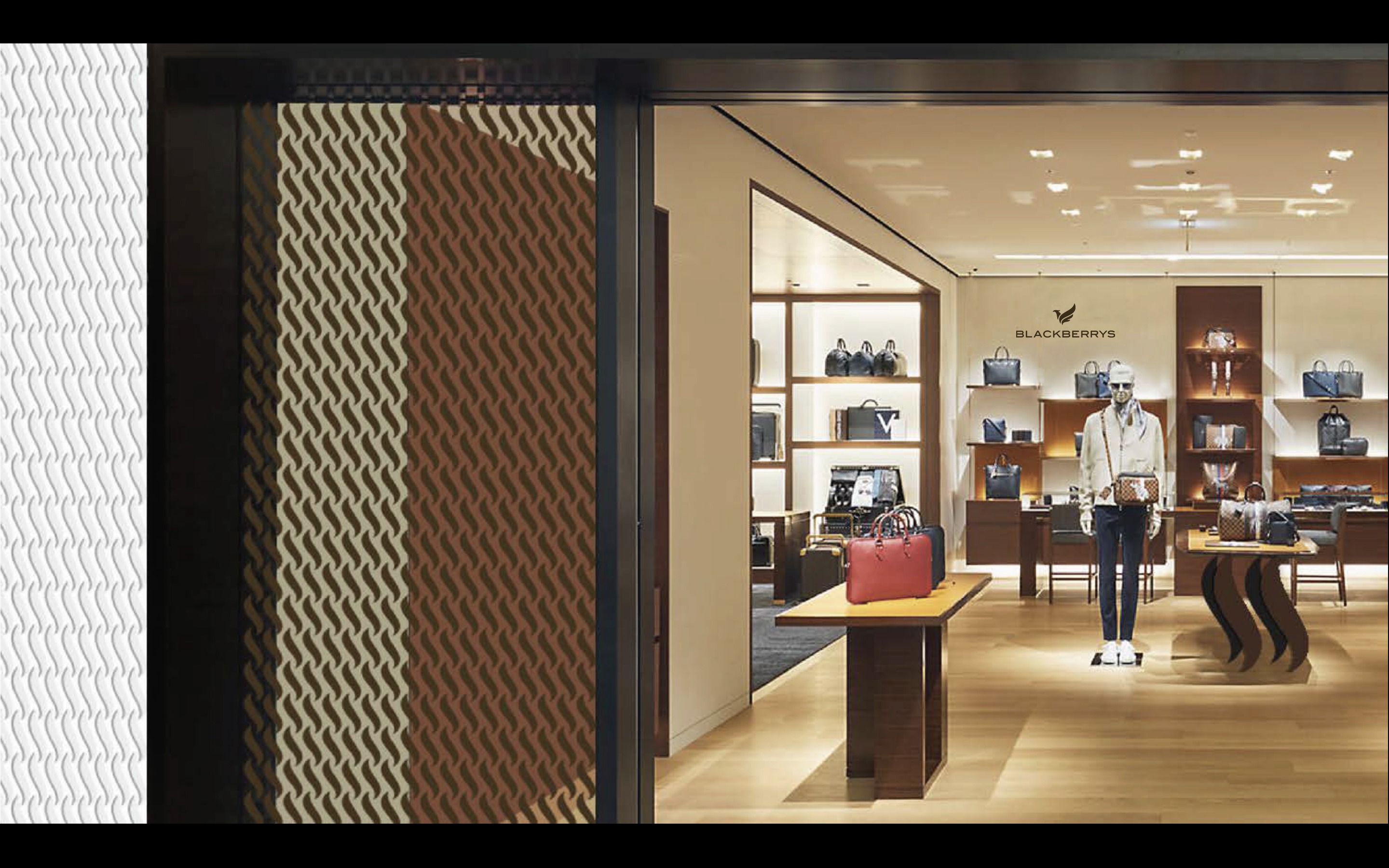
RETAIL GRAPHICS
DIGITAL DESIGN
Client
BLACKBERRYS
Collaboration
LANDOR ASSOCIATES
Location
India
Challenge
For 25 years the Blackberrys brand stood for innovation and provided Indian men with premium wardrobe solutions.
However, research indicated that with changing consumer needs and their evolving lifestyles, the Blackberrys brand had lost its energy, dynamism and aspiration. To unlock its growth potential, Blackberrys required to transform and reinvent itself.
Approach
Retaining the consumer as a loyal fan only comes when one delivers what they seek, what brings excitement among them. The effort was to define a brand that preserved the emotional connection between the customer and the product. A reformed holistic experience was created across all brand touch points that stemmed from in-depth research, competition landscape and a well mapped strategy that translated into the brand's design. A distinct visual identity, retail store graphics and the digital interface of the brand was crafted. The new Blackberrys man was born.
In today’s world, success is not about what one has achieved but what the next challenge is. It is a constant quest – a journey. Every milestone is a platform to aim for the next opportunity. This philosophy was a starting point and it gave rise to the brand idea – ‘Burning Desire’.
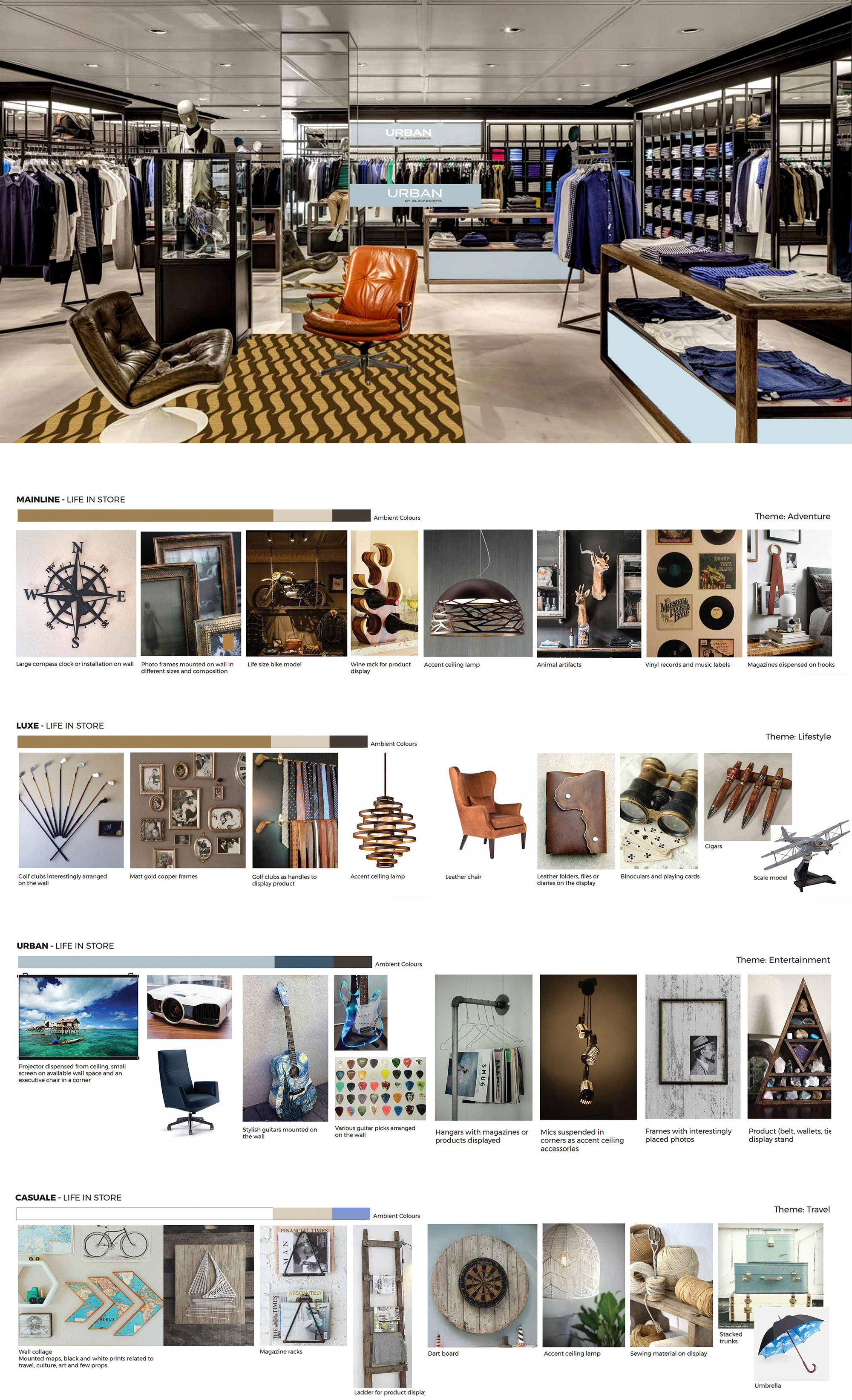
The Blackberrys brand was further divided into 4 sub-brands. The analogy of 4 brothers defined an interesting visual brand driver framework reflecting their personalities, preferences and phase in life. The demarcation was clear, notably different and sharply outlined. This crisp segregation was seamlessly integrated with and tied back to the Blackberrys core brand ethos.
But how do we communicate the ideology of ‘burning desire’ to the consumer?
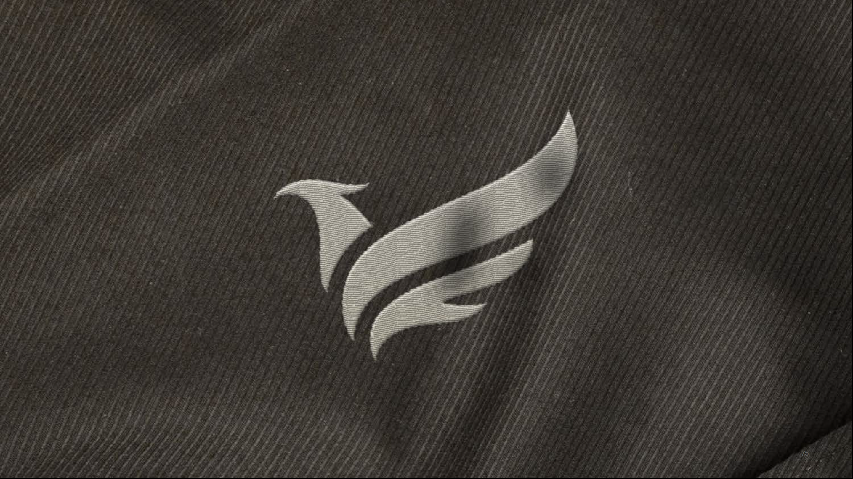
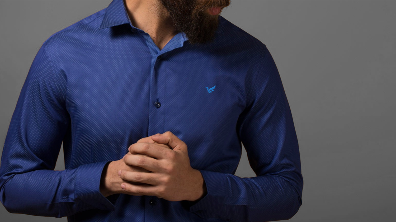
The personality traits to describe the Blackberrys man were courageous, driven, self-assured and insatiable. These attributes came alive through the inspiring story of the phoenix bird. The graphic phoenix icon stood for eternal renewal and reinvention of oneself. It was named the Fire Bird.
Corporate stationery reflecting the master brand and its subsets was sleekly crafted and designed to clearly showcase the hierarchy.
Extrapolating from the Fire Bird symbol – a super graphic evolved. It was an independent unit and named the Blackberry Flame. Manifested in various modular formats, orientations and patterns, it lived fearlessly across various brand touchpoints.
Various prop and accessory ideas based on themes that suited the 4 categories were identified and placed in-store to elevate the experience.
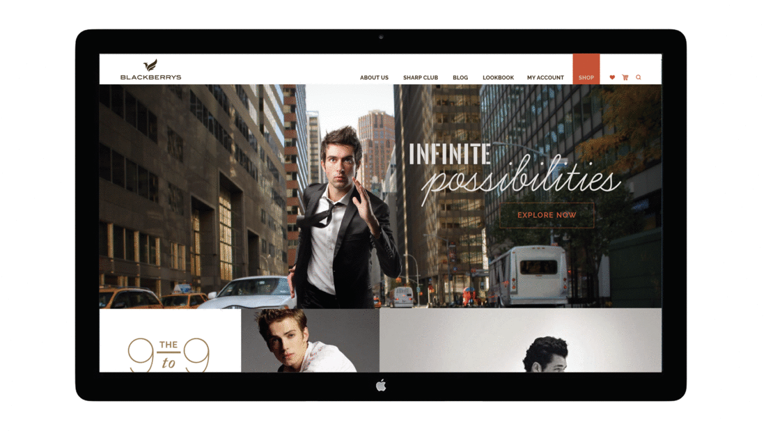
The digital presence was a combined site of the corporate and e commerce store. Modular design ensured a robust responsive interface.