Tim Hortons.
Retail communications and visual merchandising for the Canadian coffee brand in India.
Scope
Client
Duration
Year
/
Challenge
(01)
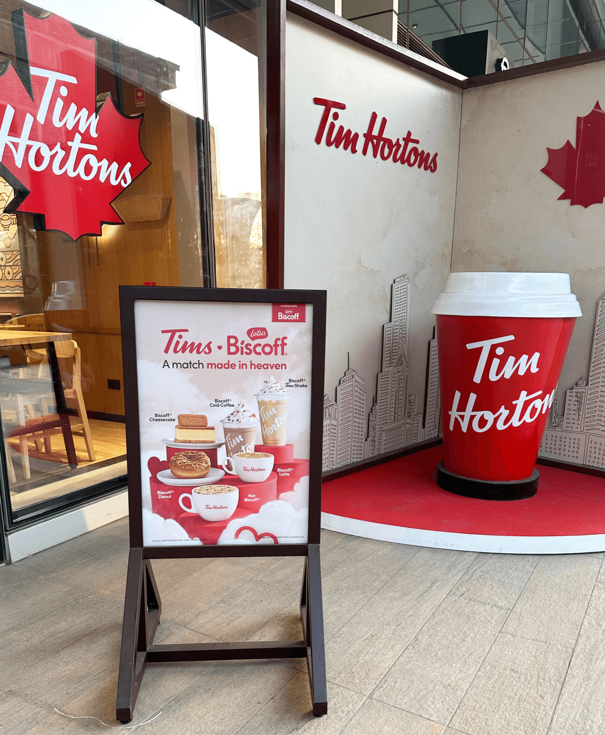
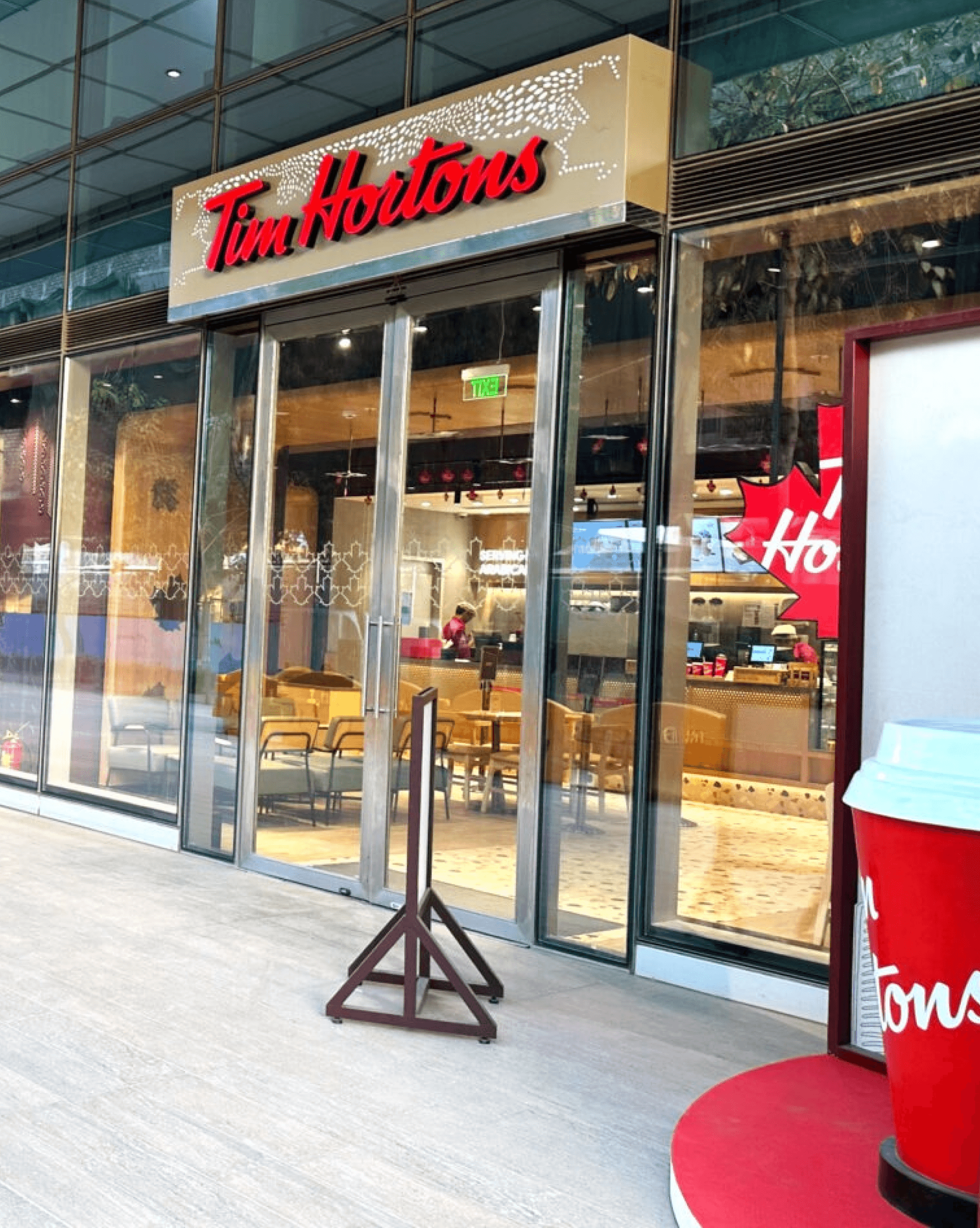
Tim Hortons needed to transform its retail spaces into warmer, more engaging brand experiences in India.
While Tim Hortons had built strong momentum in the Indian market, its physical spaces remained largely functional and lacked the warmth and engagement needed to elevate the customer experience.
/
Approach
(02)
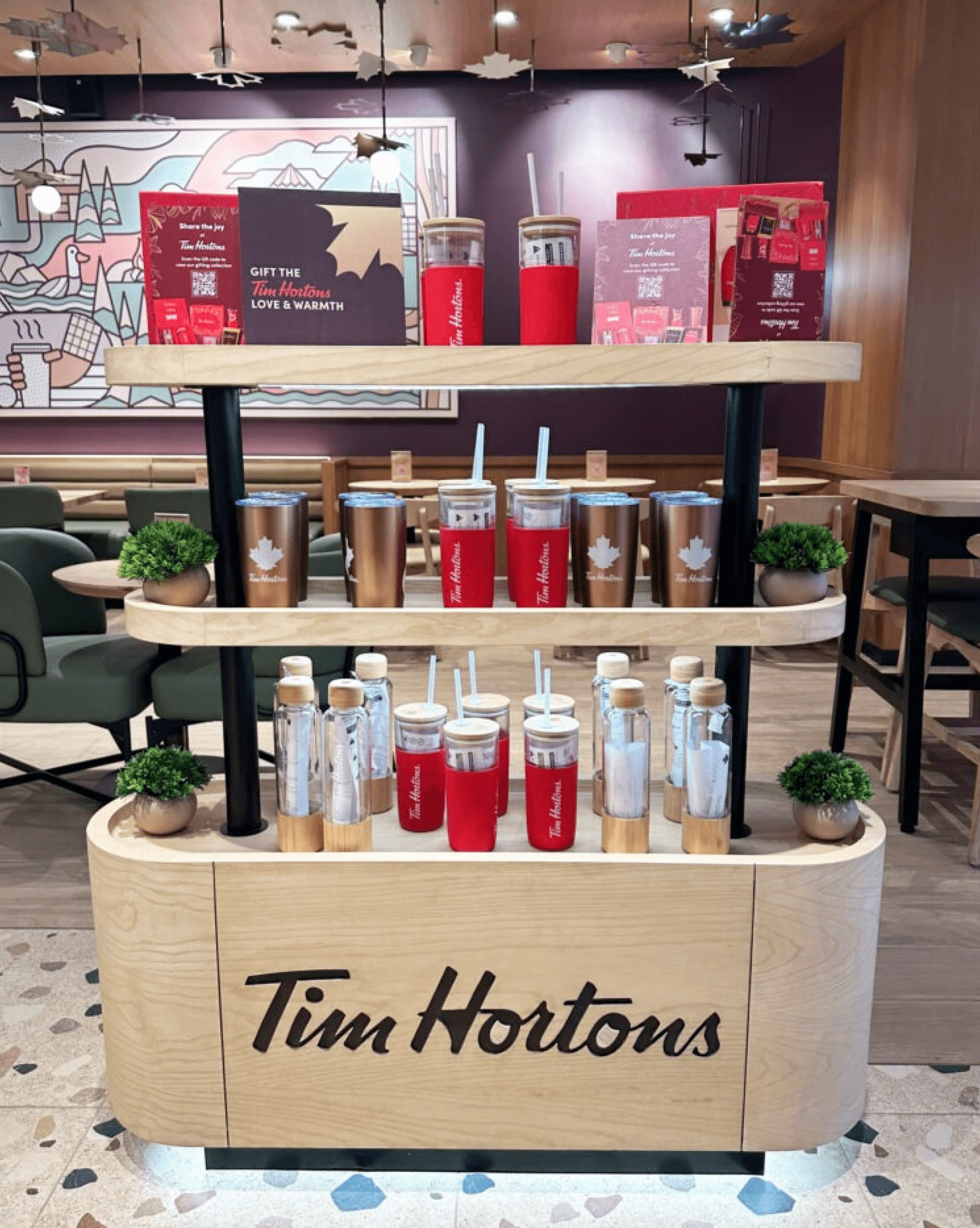
A strategic direction crafted to bring clarity and connection to Tim Hortons’s in-store experience.
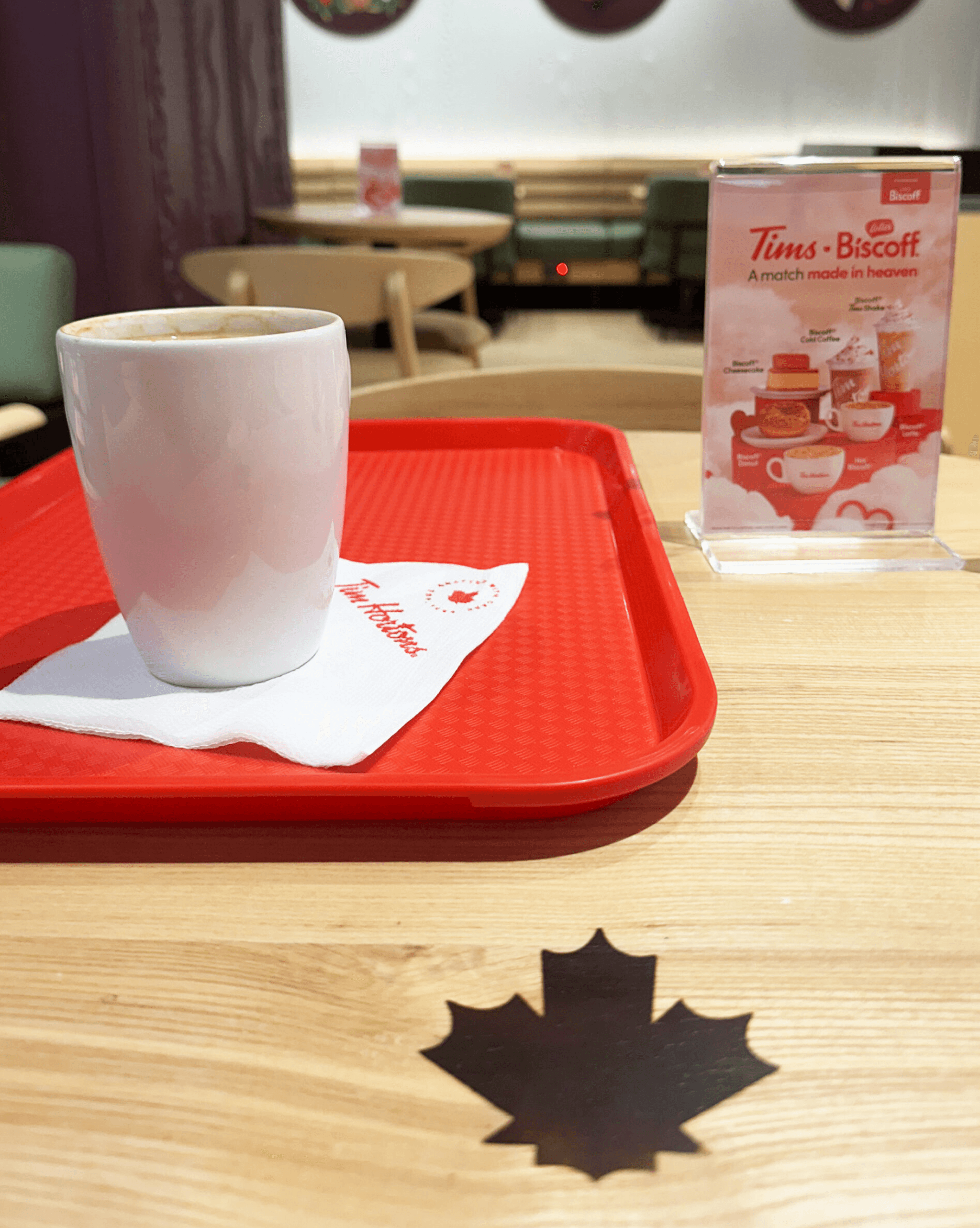
The effort was to redesign the retail communication and in-store environment through cleaner, more functional layouts and elevated photography that better showcased the offerings. The goal was to improve navigation, enhance customer interaction, and create a warmer, more contemporary brand experience aligned with Tim Hortons’ values.
/
Output
(03)
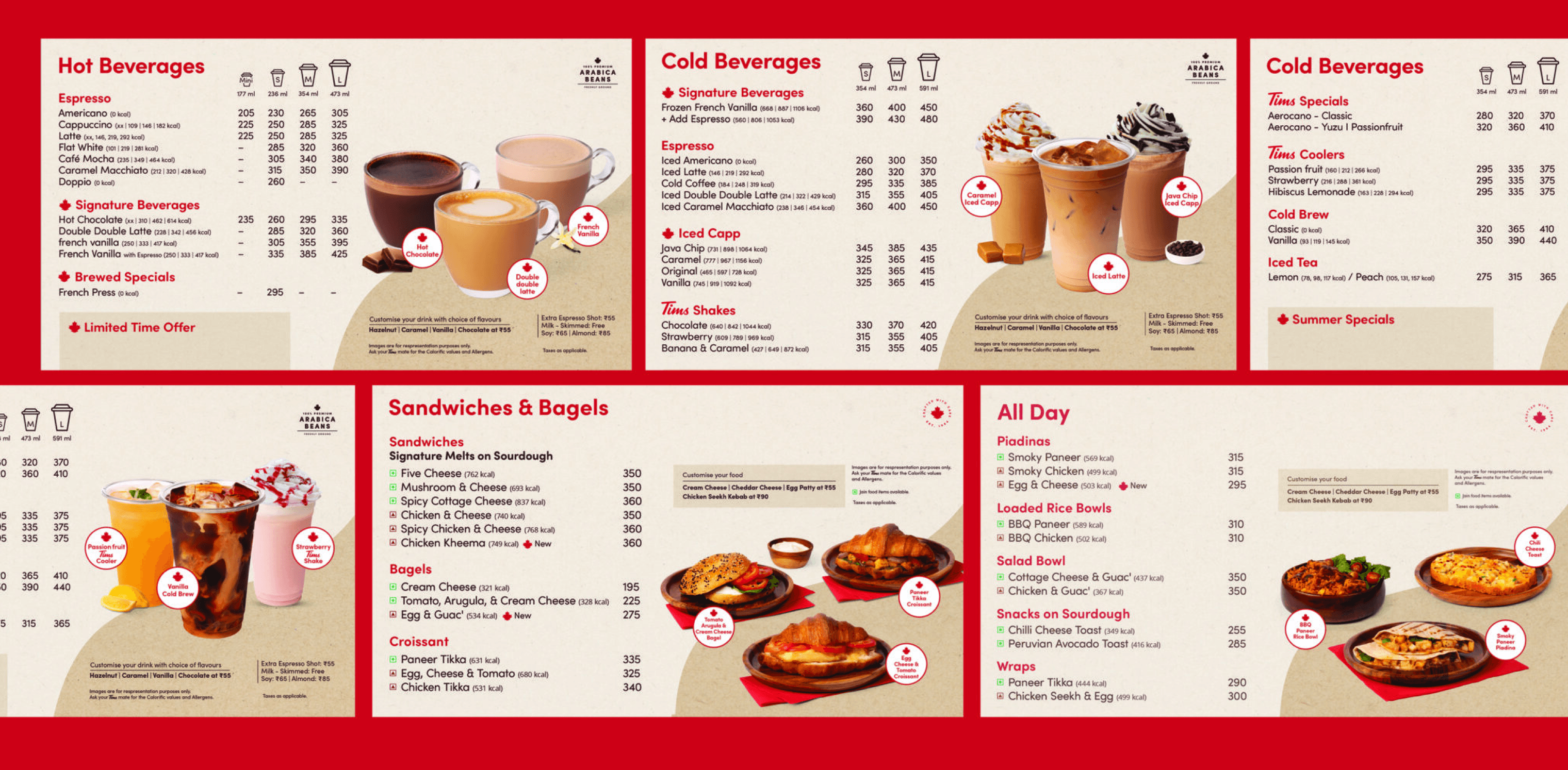
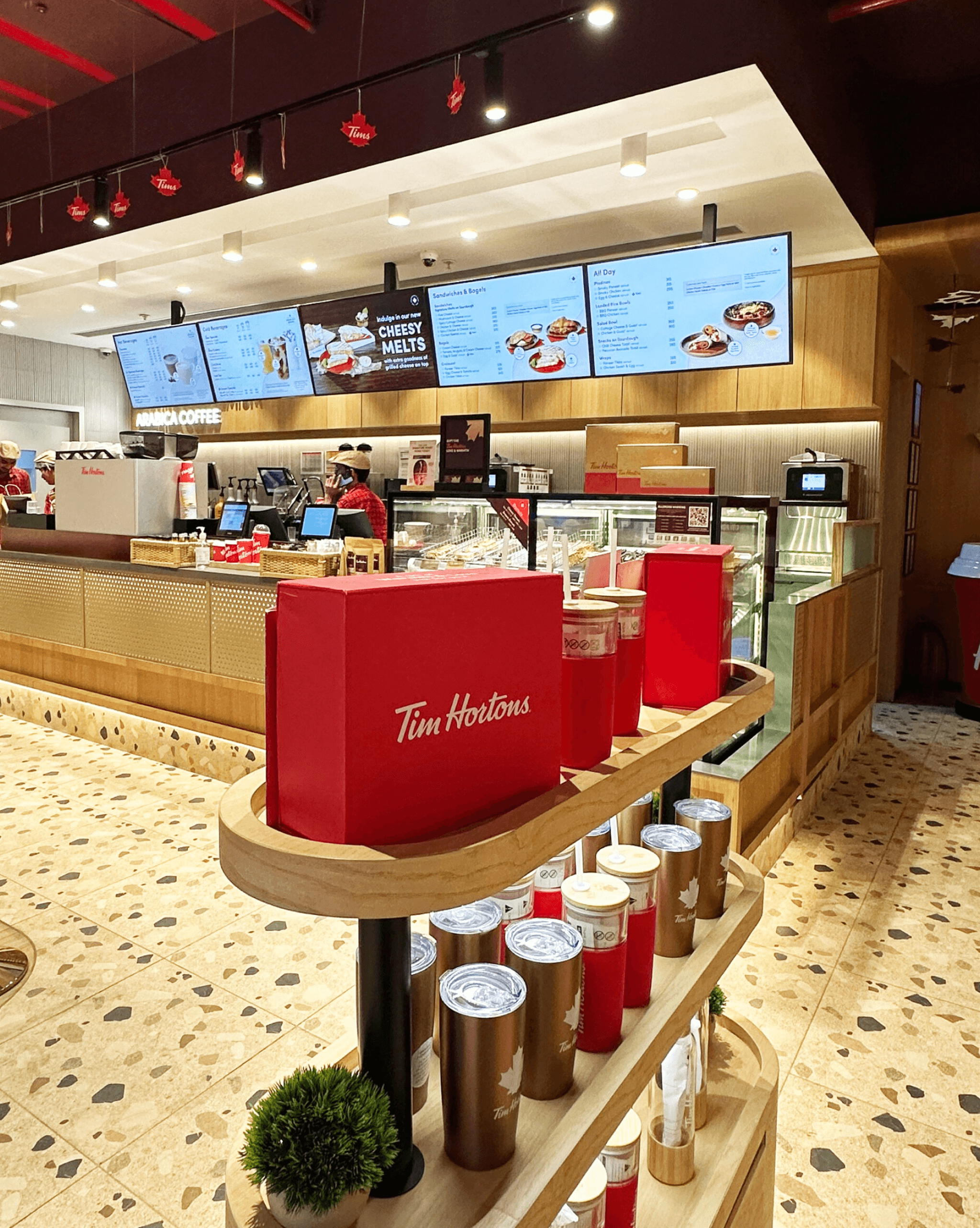
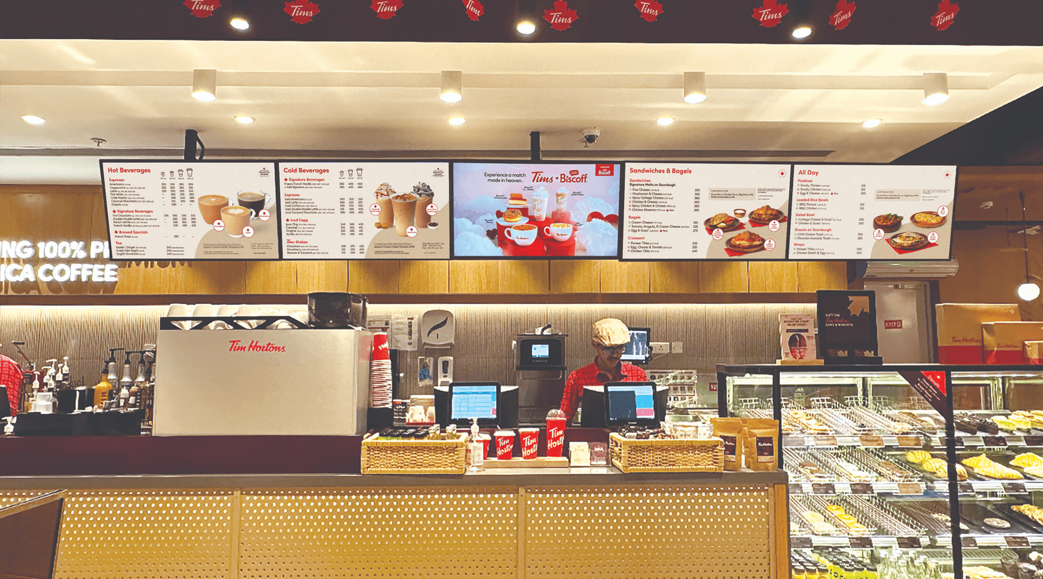
Redesigned Tim Hortons’ menu and in-store communication system to improve clarity, consistency, and customer experience.
The new system is built on strong visual hierarchy, modern typography, and a disciplined grid that improves scanability and speeds up decision-making. Menus are modular and time-of-day responsive, allowing seamless updates across breakfast, lunch, and evening without disrupting layout consistency.
High-impact menu photography was introduced to elevate product appeal, while maintaining a clean, uncluttered presentation. Bestsellers are strategically highlighted for visibility, and signature items are clearly marked using brand assets for easy recognition.
Pricing, product grouping, and informational elements follow a strict hierarchy to reduce cognitive load and improve order efficiency. The result is a menu system that is cleaner, faster to navigate, and more intuitive for customers across formats.
This project is presented as a concise overview; a detailed case study is available upon request.